UX is everything
Let me ask you a question about user experience, which is close to my heart, given that I live in Turin 🇮🇹, where every 3rd person seems to own a dog 🐶

How would you feel if you were walking down the street and someone threw a piece of dog 💩 at you?
Now, how would you feel if you were walking down the same empty street, but this time you stepped into that 💩 yourself? Would it make any difference?
I personally would be equally furious in both cases, since both are a terrible user experience for a simple activity of “walking down the street”. The only difference between them is that in the 1st case I would have the exact reason of my bad experience standing right in front of me, readily available to throw my anger at.
Instead, in the 2nd case the responsible person, the dog owner, is not available. They even didn’t target me personally – it was a situation ready to cause bad user experience to whoever will “get lucky”. Yet I would still be very unhappy, to say the least, because I know very well how the experience of “walking down the street” could be if they hadn’t ruined it.
😌 User Experience = Quality of Life
Stepping in dog 💩 is a perfect analogy of how I feel every time I have a bad user experience of any kind, being it a cumbersome interface of a phone app, a car blocking my ride in the bike lane or unorganized crowd of parents picking up their kids from school all at once.
Like the dog shit on your shoes, none of it is a life-threatening tragedy. It simply adds unnecessary, often unpleasant, interruptions to your peaceful “walk down the street”, stealing your time, energy and peace of mind.
Ultimately it degrades your quality of life. This is why I believe that the abbreviation UX should be used way more often in everyday discussions, going far beyond the articles about web-design and marketing.
Good UX should be a baseline, not a premium feature.
💛 Good UX is respect
When I think about why a dog owner would leave their dog’s shit on the sidewalk I imagine two possible reasons:
- the dog owner was not aware of the disaster it might cause to someone;
- the dog owner was blatantly careless about it.
While the first case may deserve a tiny bit of empathy, it’s also the most unlikely, I think. In the second case, the person should be punched in their face straight away. A lack of care about others is disrespect. And I think you’d agree that being respected by others is one of the fundamental aspects of a civilized society.
When it comes to paid products or services, the responsible companies are being paid to design and implement our user experiences. Therefore even the lack of awareness is not an excuse. It effectively is a lack of care as well, simply delegated to the management level. So no matter how you look at it – your bad user experience almost always is a sign of disrespect to you as a customer.
📢 Talking about UX
I’ve been to many places, seen different ways of living, used various products, read lots of articles on UI/UX design. So I often notice bad user experience and immediately see how things could have been done better.
In most cases I simply get annoyed, because the people responsible for it are either not accessible or don’t really care about making it better anyway. But recently it was brought to my attention that often people genuinely don’t even realize that their experience could have been better, because they don’t know exactly how. So instead of simply rumbling about it I’ve decided to turn my thoughts into something more structured and potentially useful for others.
❗️ With this blog I’m hoping to inspire people to pay more attention to their own user experience, care more about experience of others and ultimately improve the quality of life in our society.
If some of you turn out to be the ones actually designing or making decisions on UX of others, I would be glad to make a difference 😇
🚦 Good UX vs Bad UX
Apple products have played a pivotal role in the development of my taste in design and user experience – both aspects that made them stand out in the consumer-electronics market.
I personally think that the best thing about computers and laptops made by Apple is the fact that they run on the macOS operating system, which defines the user experience to a greater extent than the design, build quality or performance of the computers themselves. There are other brands that manufacture computers of comparable quality and performance, but only Mac computers can run macOS natively.
Apart from some foundational features differentiating it from Windows or Linux operating systems, there are plenty of tiny details in macOS that make me feel like people designing it actually cared about my user experience.
Here are a few examples…
✅ QuickLook in Finder 👁️🗨️
This was the first thing that truly impressed me when I switched from PC to a Mac. In macOS you can select a file, press `Space` on your keyboard and instantly see its contents in a minimalistic overlay window with some very basic controls to explore its contents. It does it so quickly because it’s not launching an actual application associated with that file format, which has to load the full-blown interface, taking up to dozens of seconds.
Yes, Windows Explorer does let you see thumbnails of images and a few types of documents, but it’s fixed in the interface and is very limited – meant to get a rough idea how the file looks. Instead, macOS Finder supports way more file formats: from images and videos to text and calendar files, while its separate overlay window can be moved and resized freely, such that you can actually zoom in and scroll to the exact portion of the document you’re actually interested in. And another press of `Space` key closes the preview immediately.
Usually when making a presentation or a writing a document, you have multiple intermediate versions stored in the same folder, as you’re approaching the “final draft“. Apple’s approach makes it naturally effortless to quickly sip through dozens of older versions using keyboard ⬆️ and ⬇️ arrows, looking for the removed older slide you want to recover or to find some 3-year-old presentation that had a diagram you want to reuse now. Or you pick 2 nearly identical versions of a photo and switch back and forth to immediately see what has changed. It’s just extremely convenient and fast.
These things are unbearably complicated and slow when you don’t have the QuickLook capability. So once you get used to working this way, sitting behind a Windows Explorer again feels like putting your clothes on using only one hand. It’s not simply 2x slower than doing it with both hands – it’s a completely different experience.
✅ Option key ⌥
This one is quite an elegant and subtle feature of macOS that even plenty of Mac users are not familiar with – some actions throughout the operating system behave differently when you hold the ⌥ (alt/option) key.
For example, some items in the context menus of many apps have a less-frequently-used version of the same action, like `Close` and `Close All…` to close all windows of the app, or `Paste` and `Paste without formatting` in a Word document. In macOS such “niche” items are not displayed unless you press the ⌥ key, which replaces the default version of the action with the alternative one, also propagating it to the key shortcuts. I find this to be a really elegant way to fit the same amount of functionality in a visually cleaner interface, making it less cluttered and overwhelming.
Another example – normally when you click on the WiFi/Bluetooth icon, you see a very simple list of available networks/devices that you can connect to, which is what you’re interested in 99% of the times. But if you also hold the ⌥ key, you see lots of extra information, like MAC and IP addresses, signal/noise levels, etc., which are only relevant for expert users. In particular the WiFi info pane is really handy when you’re trying to find a spot in a cafe with better WiFi signal – just go around and watch the `Tx rate` change. The higher the number, the better data-transfer speed you’ll get.
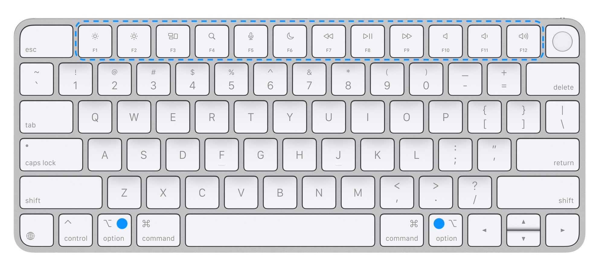
Finally, all Mac keyboards have a row of special function keys at the top to control your display brightness, speaker volume, etc. If you press those buttons while holding ⌥ key, macOS will open System Preferences with the section related to the button you’ve pressed, where you have access to advanced Display or Sound settings. Another convenient shortcut that is much faster than getting there manually.
✅ Alternative characters Ø
More than 90% of the time I’m typing in English (both conversations and programming code), so I’m using the default ABC keyboard layout. But living in Italy I often have to type in Italian, which uses extra characters with accents, like è, é, ò, ó. So instead of switching to a dedicated Italian layout, I can easily get those extra accentuated characters by pressing and holding the base letter followed by a number corresponding to the special character I need.
In addition, sometimes I use “umlauts” that appear in some German and Dutch brand names, like Kärcher, Rösle, Häagen-Dazs. Or to write accurately the name of the experiment in US where I used to work before my PhD, which was technically called DØ, where Ø stands for “zero“.
Sometimes I just want to show off, writing the French spelling of “naïve”, which brings me a bit of joy, since letter `Ï` is a distinctive letter in the Ukrainian alphabet and quite rare in other languages.
Of course all these characters can also be found in the dedicated pane with hundreds of emojis, flags, math and other special symbols. But pressing and holding one key is way more efficient → much better user experience.
💔 Keyboard brightness 🔆
To not sound like an Apple fanboy, let me also mention an example of bad UX from them, which I find pretty frustrating and careless.
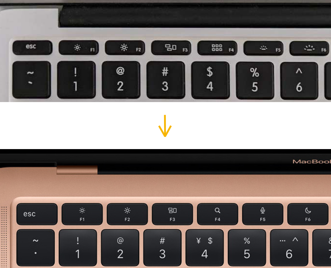
For many years all Mac keyboards had 2 buttons (F5, F6) in the top row for controlling the backlight brightness. I used them always to switch between just two levels:
- completely OFF: during the day or when I’m watching something at night;
- ON at lowest brightness: when working at night (I don’t like bright cold light).
Starting from 2021 or so they’ve replaced those 2 keys with a Dictation and Don’t Disturb keys, without any possibility to get the old functionality back.
Trying to understand why they would do such a thing, I imagined that they must have looked at some usage data and came to the conclusion that only a small fraction of their customers actually use those buttons. Probably most people are either happy with it being always ON (relying on auto-adjustment) or don’t use it at all. So I must be more demanding than others to the amount of light that I want to see coming from my keyboard 💡

On top of that, for a couple of years preceding this change they’ve been shipping laptops with the configurable interactive touch-bar instead of the fixed keys. This means that in principle they could have seen exactly which custom keys their users had been actually using most often. So as a data-scientist myself I have to respect data-driven decisions like that. Yet the problem is not in the decision – it is in the careless execution.
There are two obvious ways how they could have kept the old functionality for “niche“ users like me, without interfering with their decision to remove the keys in any way:
- let the display-brightness keys (F1, F2) control the keyboard brightness when holding the `Shift` key – elegant, logical and technically pretty simple;
- let the new keys be simply F5 and F6, making the actual functions attached to them configurable in the keyboard settings – more flexible and inclusive, but also technically more complicated to implement.
In the end I’ve ended up installing a dedicated software for custom key bindings to implement the 1st solution, which I’m fairly satisfied with. Yet it is not a frictionless experience by any means, and it poses a security risk that comes with any 3rd party software. I would expect something like this on a Windows machine, but certainly not on a Mac.
Given how obvious and technically simple this solution is, not implementing it must have been a choice – a deliberate choice of being careless about the user experience.
🎬 Epilogue
Returning to the beginning of this post – life is already hard enough on its own. Let’s not add more shit to it.
Whether we have to clean it off our shoes or need to constantly scan the street to not step in – it takes away the energy, the focus and the joy of life, multiplied by the number of people experiencing it.